Zoom Redesign.
Navigating the Path to a Healthier Video Conferencing Experience
Overview
In March 2020, the world underwent a seismic shift due to the Covid-19 pandemic. Remote work became the norm, propelling video conferencing tools like Zoom into unprecedented popularity. However, an unforeseen consequence emerged: "Zoom Fatigue."
People reported mental strain and exhaustion resulting from excessive video conferencing.
User Research.
To truly understand the complexity of "Zoom Fatigue," I conducted in-depth research to uncover insights from both experts and users.
Desk Research
During the desk research, I delved into scientific articles, and expert opinions related to the phenomenon of "Zoom Fatigue" and ways to overcome it. Here are the key findings and outcomes:
Overall, these insights provided a solid foundation for understanding user pain points and informing the design of innovative solutions to address these challenges.
Causes of Zoom Fatigue
● "Zoom Fatigue" is mainly caused by prolonged and constant virtual interactions, leading to increased cognitive load and decreased engagement. The continuous need to maintain visual focus, coupled with limited non-verbal cues, can result in mental exhaustion and reduced well-being.
Effects on Mental Health
● The research highlighted the impact of excessive video conferencing on mental health, leading to feelings of stress, anxiety, and burnout. Users felt disconnected and fatigued after a series of virtual interactions.
Lack of Breaks and Transition Time
● Users expressed the lack of adequate breaks and transition time between back-to-back meetings. The continuous stream of meetings resulted in cognitive overload and hindered their ability to process and retain information effectively.
Non-Verbal Communication Deficits
● The inability to rely on natural non-verbal cues during video calls made it challenging for participants to gauge social dynamics accurately, resulting in higher mental effort to comprehend conversations.
Engaging with users
Directly engaging with users was paramount to capturing their experiences and perspectives. I crafted a series of user interviews and surveys, organized around three central themes: users' Zoom usage patterns, their positive interactions, and the pain points they encountered.
The open-ended nature of the questions enabled users to provide rich insights into their behaviors, preferences, and pain points related to video conferencing.

User Persona
Meet Emily, a driven Marketing Manager fully embracing the virtual work landscape. As the pandemic reshaped our routines, Emily found herself navigating a world of virtual meetings. As the months went on, she realized that staring at the screen for hours was taking a toll on her concentration and energy levels.

Empathy Map
I conducted an empathy map activity to better understand the perspective of Ben, one of the primary users facing "Zoom Fatigue." This activity aimed to delve into Ben's thoughts, feelings, actions, and pain points related to his experience with virtual meetings.

Pain Points
Based on user interviews and surveys, I unearthed the prominent pain points contributing to "Zoom Fatigue":

Mental & eye Exhaustion
Users reported feeling mentally drained after extended video calls with prolonged camera gazing which lead also to eye fatigue.

Unstructured Meetings
Lack of clear agendas and organization led to disengagement and difficulty in keeping track of discussions during meetings.

Continuous Meetings
Back-to-back sessions without breaks contributed to fatigue as users often struggle to stay engaged and focused during meetings.
Ideation.
The Ideation phase flowed smoothly, fueled by the rich insights I gathered directly from users during the research phase. Their suggestions and desired features were a wellspring of inspiration, proving to be exceptionally rewarding.
Brainstorming
However, I remained rooted in the user needs that I had meticulously synthesized at the conclusion of the research stage. These needs were pivotal in shaping my approach during Ideation. I leveraged them to formulate How Might We questions, allowed me to generate a diverse set of creative ideas.

User journey map
Conducting user journey map helped me identify critical areas where the user experience could be enhanced, such as incorporating features to reduce meeting duration, introducing regular breaks, and providing options to alleviate mental exhaustion.

key Features
I've generated so many ideas using HMWs and user journey maps, and as it's not realistic to proceed with all of them, I narrowed down my focus to 3 solutions:
Enhancing Meeting Organization
● Enable host to set meeting agenda where they can devide meeting into sections and assign a predefined time to each section.
Space out meetings by breaks
● Allow host to set breaks before meetings and hosts to ask annonymously for breaks during the meeting.
Take camera-breaks
● Nudge participants to take camera breaks every now and then by reminding them to turn off their cameras.
Keep track of meeting progress
● Include a progress bar with chapters that represent sections to help participants to keep track of the meeting progress.
Differentiation:
The new features introduced in the Zoom redesign set it apart from traditional video conferencing platforms. The addition of a dynamic meeting agenda, progress bar, and camera-free time feature provides a unique and engaging meeting structure.
These differentiating features not only improve the user experience but also address the core issue of mental fatigue associated with prolonged video calls.
Sketches
To transform the suggested solutions into a more concrete form, I've used the Crazy Eight technique to create sketches of the app's main screens.
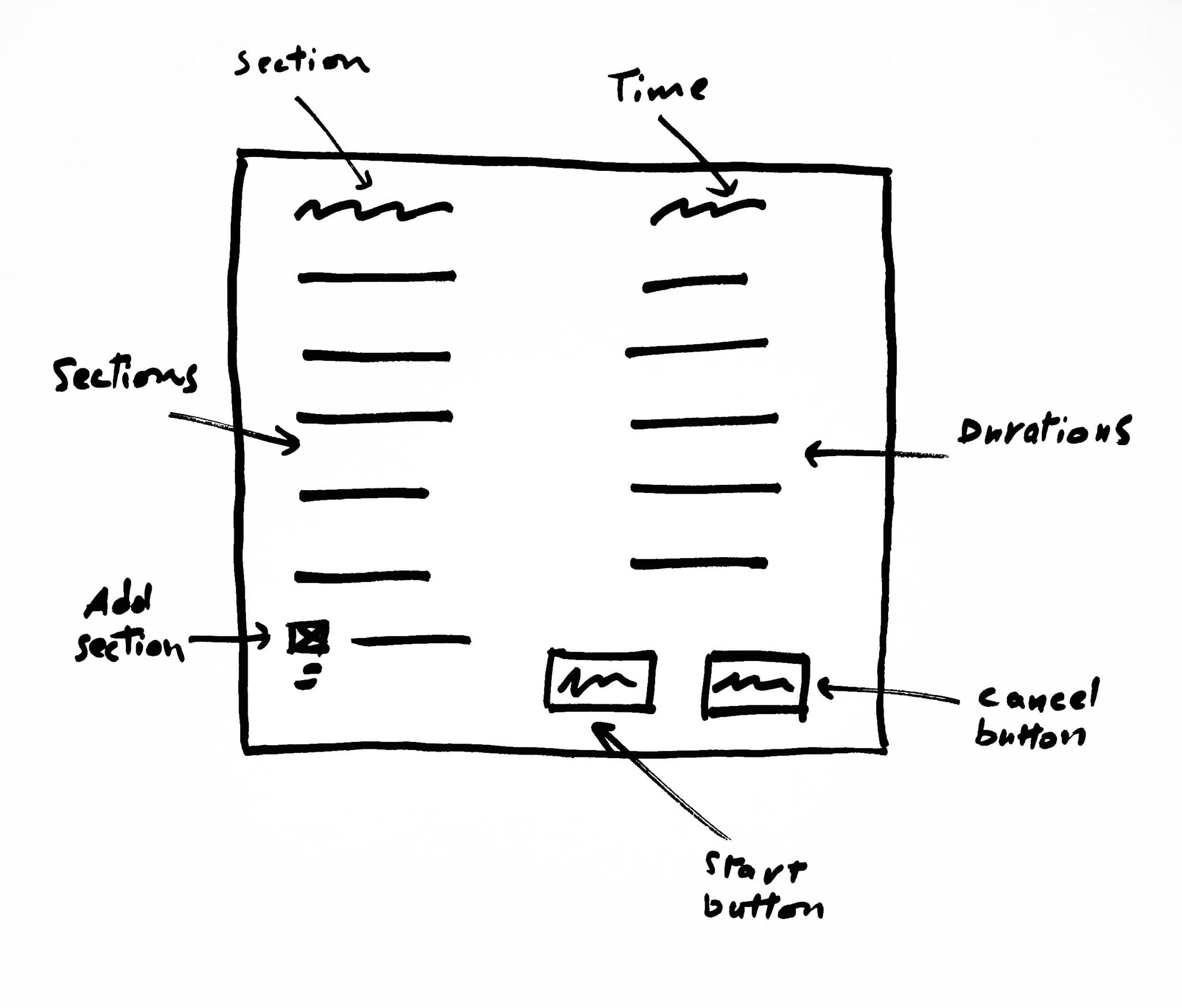
Meeting Agenda
Hosts and participants can collaboratively set the agenda for the meeting using this table.
Progress Bar
This progress bar will allow users to become aware of the meeting progress.

Notifications
This pop-up will appear mid-meeting to remind participants of taking a meeting/camera break.

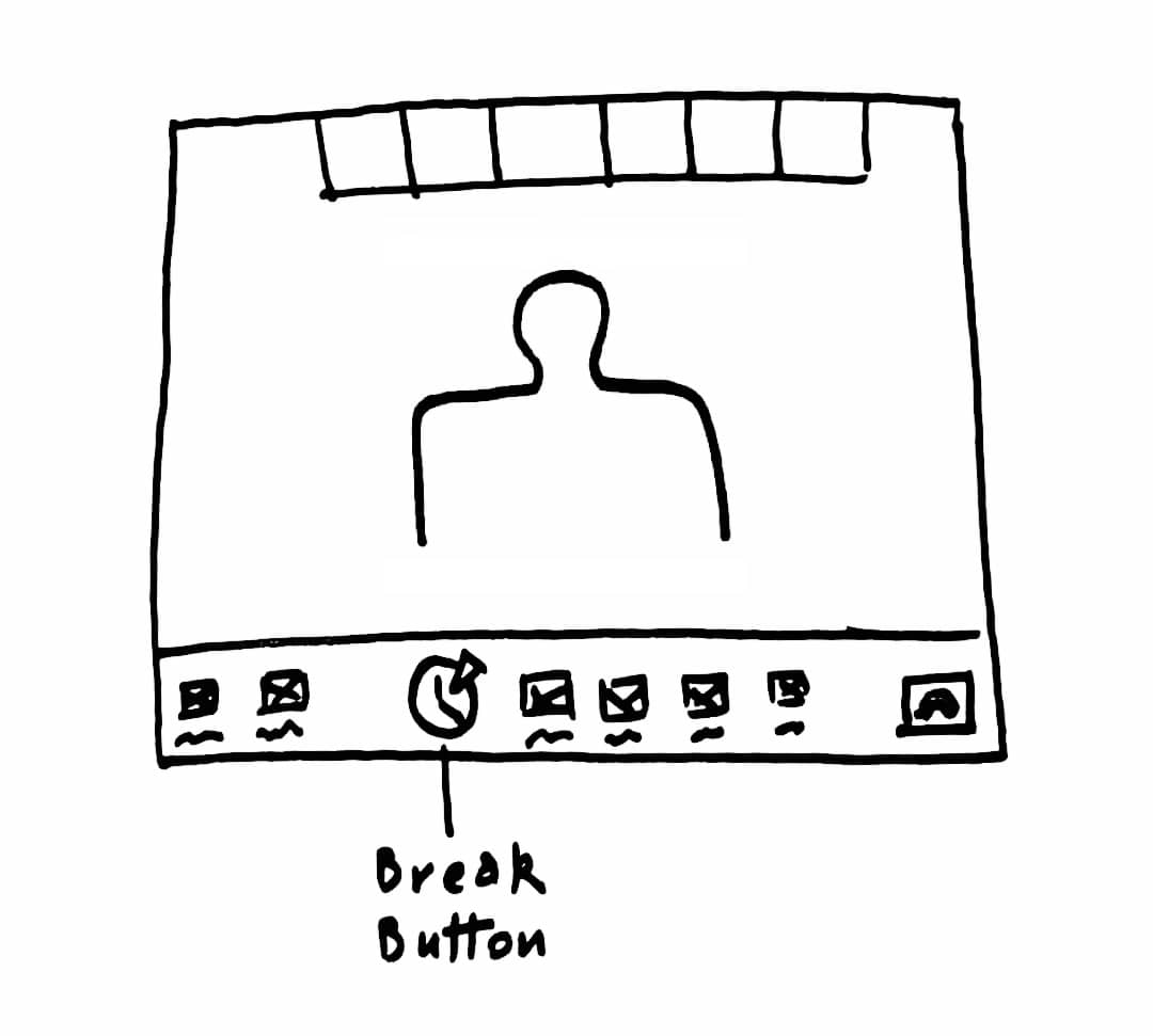
Break Button
This will allow participants to ask annonymously for a break so the host will be notified.
Prototype.
Make our design solutions more concrete and realistic, test them with real users, and iterate
Final Mockups
I nearly didn't change anything about the visual design of the product. As the research suggest, "Zoom fatigue" isn't caused by the visual experience, but rather by the lack of features that nudge users to adopt behaviors that prevent this condition.
Meeting Agenda
Using this agenda screen, the host can set the sections of the meeting and duration and frequency for the breaks and camera-free time.

Chapters feature
Whenever the user hover on one of the progress-bar chapters, the title of the section will appear on top of it.
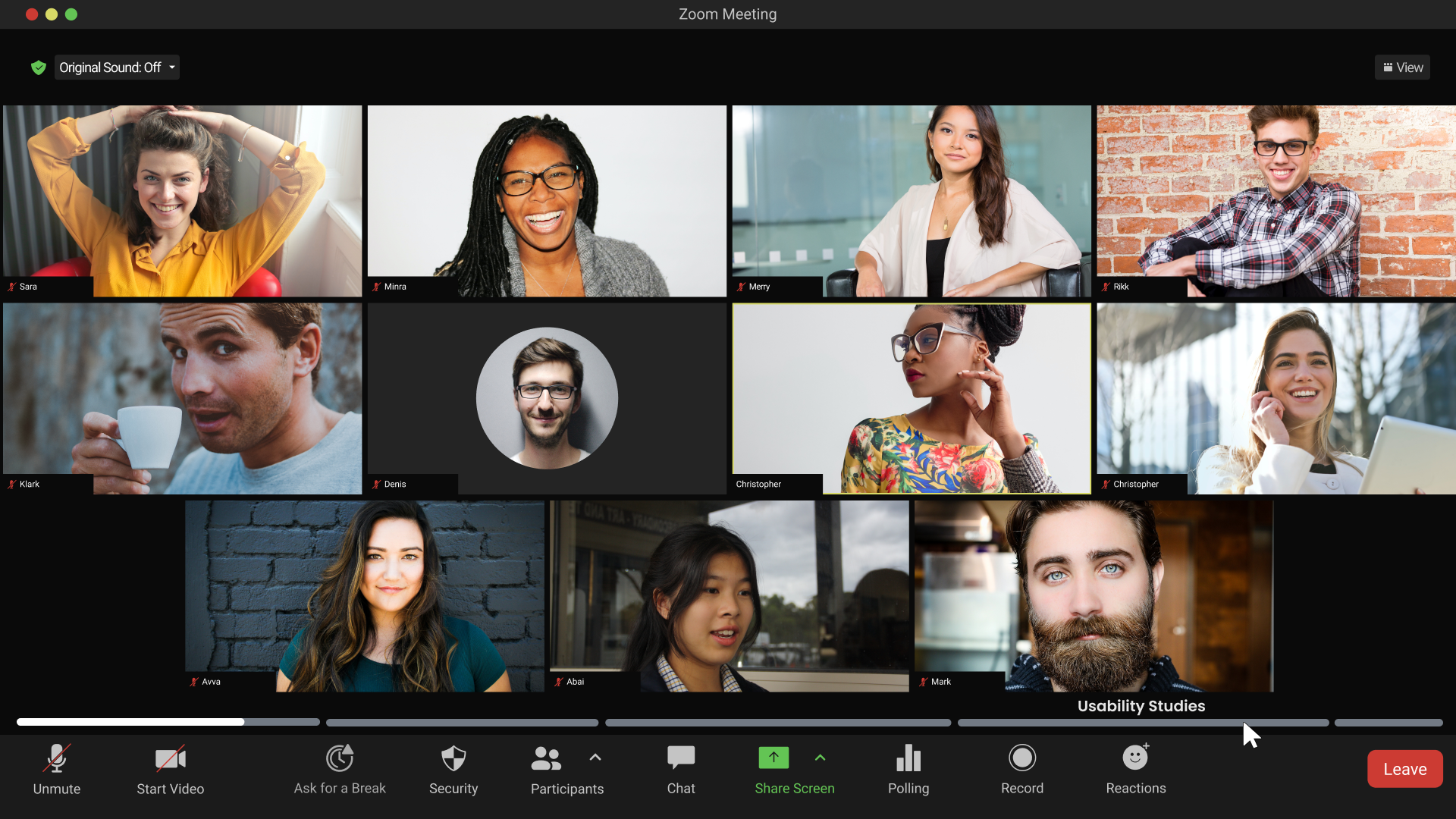
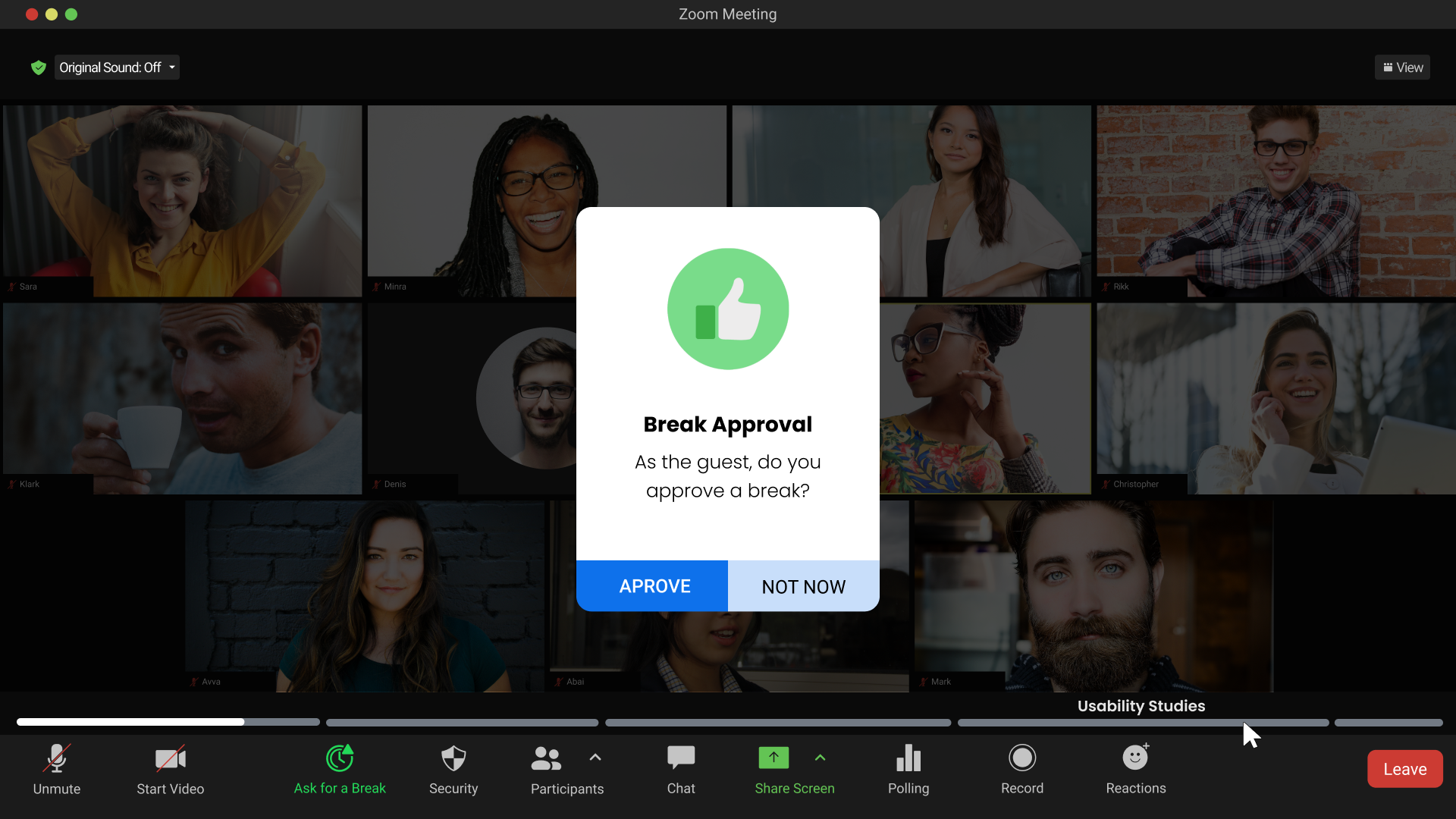
Break Button
Allowing participants to take breaks during meetings is one of the main solutions we've made, and there's two ways to attain it. either the participant ask for it using the "break" button.

The second way is by waiting for the periodic break notification that will pop-up in front of the screen.
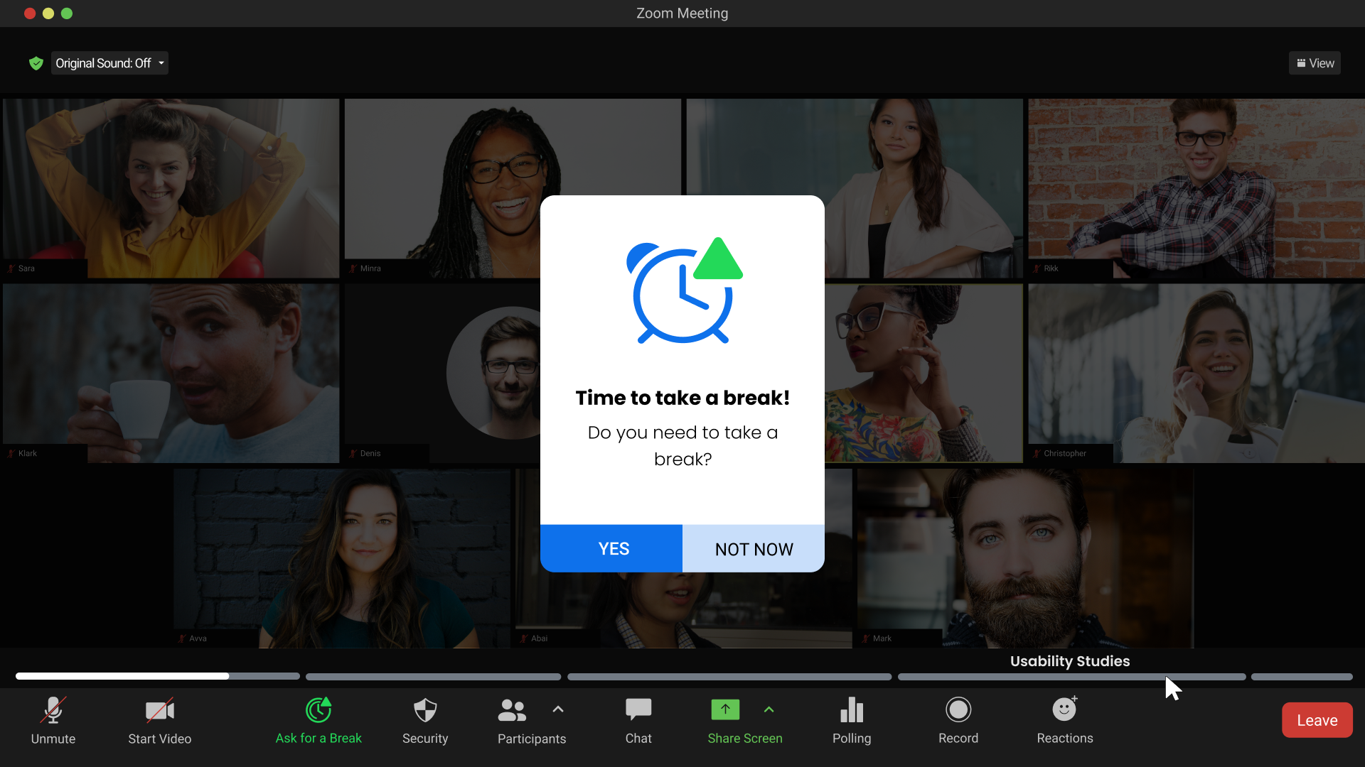
Either the majority of participants click the break button or wait until this pop-up to click the GO button. Participants still need the host approval to start the break.
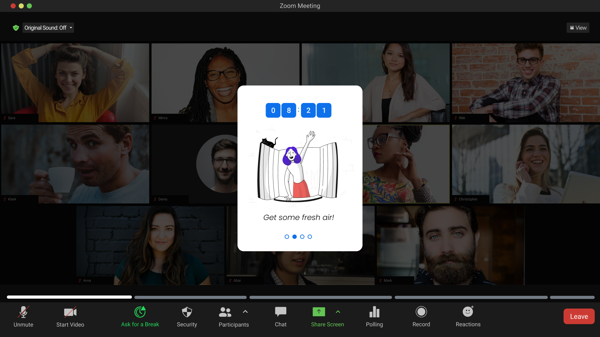
Those tips will slide back and fourth until the count down finishes to give participants insights on how to spend their break.
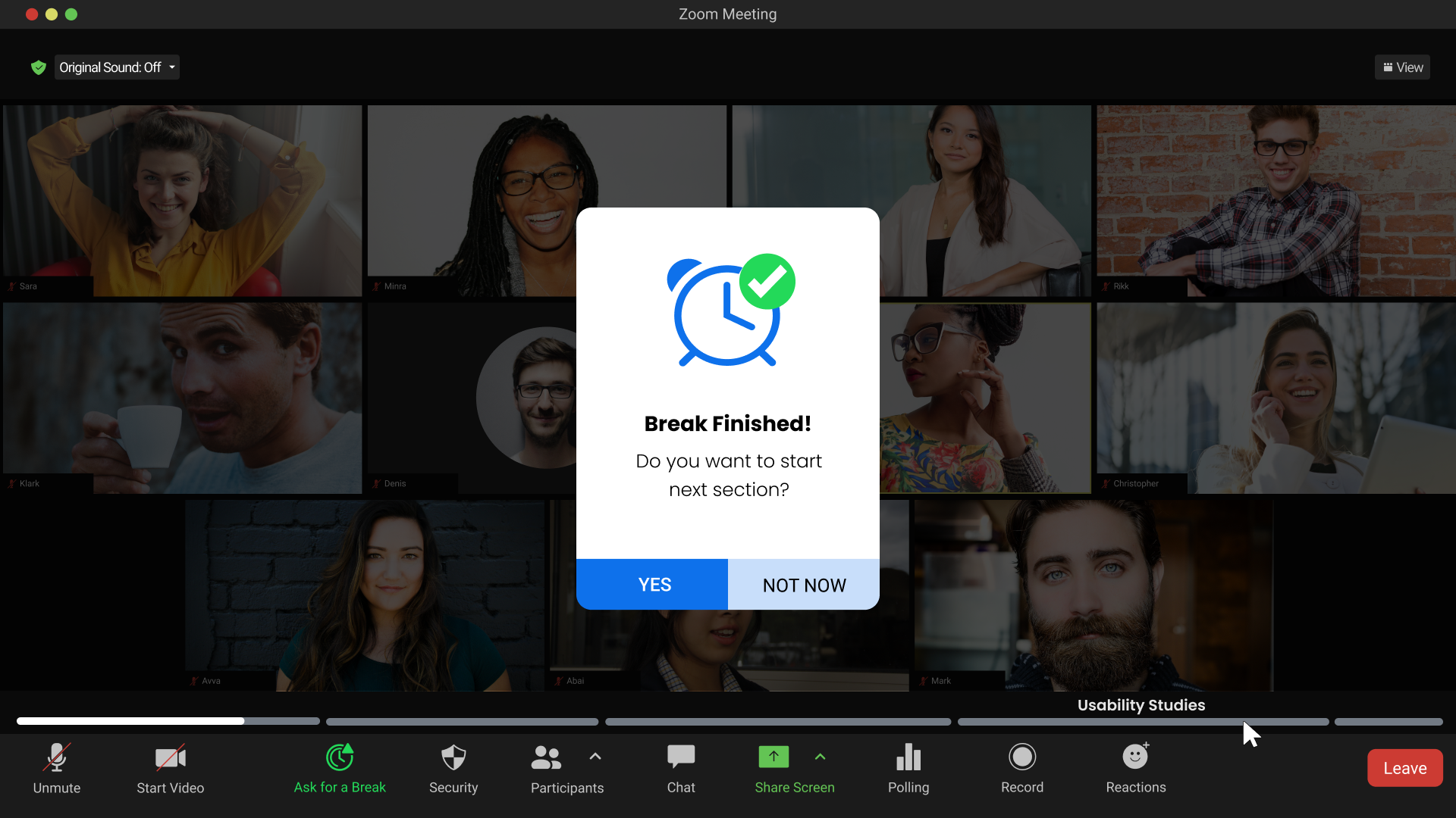
Then, the host will decide if they want to go back to meeting or extend the break.
Camera-free time
Focusing on the screen for along time is one of the causes of zoom fatigue, a periodic camera-free time would encourage users to turn off their cameras and look away of the screen for 1 minute every 20.

Takeaways.
Key reflections and learnings at the end of the project
Learnings
This is what I've learned throughout the whole process of this project, and I intend to apply it in future ones:
● Empathy-Driven Design: Designing with empathy is key. Recognizing the mental and physical strain users experience and translating this into features that alleviate their pain points is central to successful product development.
● Importance of wellbeing: No matter how much the product is important, a break from it is essential to users wellbeing. This highlighted the significance of designing features that allow users to rest their eyes and recharge, contributing to a more positive experience.
● Continuous Learning: This project reinforced the importance of staying curious and continuously learning especially after the product is launched. Staying up to date with how the product affect it's users is crucial for it's sustainability.
Next Steps
Due to time constraints, there are some ideas I couldn't concretize, and I'd like to do so if I have the opportunity in the future. These are some of them:
01
Usability Testing
Conduct thorough usability and accessibility testing to ensure that the new features are user-friendly and compliant with accessibility standards.
02
Analyze Feedback
Review the feedback collected during user testing sessions. Identify common patterns, pain points, and areas of improvement highlighted by participants.
03
Refine Design Iterations
Based on the user testing feedback, iterate and refine the design of the new features. Address any usability issues, concerns, or suggestions raised by participants.